สำหรับเนื้อหาต่อไปนี้ เป็นตัวอย่างเกี่ยวกับการใช้งาน slideshow โดยใช้ Carousel Component ของ
bootstrap 4 เป็นการเพิ่มรูปแบบการแสดงหรือนำเสนอข้อมูลอีกรูปแบบหนึ่ง ที่นิยมนำมาใช้งาน นอกจาก
นั้น เราจะเสริม เกี่ยวกับการประยุกต์การสร้างลิสรายการ ที่สามารถเลื่อนเลือกหัวข้อในแนวนอนได้
เช่นเคย เราจะใช้ตัวอย่างโค้ดต่อเนื้องจากบทความที่ผ่านมา เพื่อต่อยอดเนื้อหาให้สมบูรณ์ขึ้น
สามารถทบทวนเพิ่มเติมได้ที่บทความ
แนวทางประยุกต์ใช้งาน Card แสดงรายการ Feed ใน Bootstrap 4 http://niik.in/883
https://www.ninenik.com/content.php?arti_id=883 via @ninenik
การใช้งาน Carousel Component
ตัวอย่างโค้ดเริ่มต้นประกอบคำอธิบาย
ไฟล์ demo.php
1 2 3 4 5 6 7 8 9 10 11 12 13 14 15 16 17 18 19 20 21 22 23 24 25 26 27 28 29 30 31 32 33 34 35 36 37 38 39 40 41 42 43 44 45 46 47 48 49 50 51 52 53 54 55 56 57 58 59 60 61 62 63 64 65 66 67 68 69 70 71 72 73 74 75 76 77 78 79 80 81 82 83 84 85 86 87 88 89 90 91 92 93 94 95 96 97 98 99 100 101 102 103 104 105 106 107 108 109 110 111 112 113 114 115 116 117 118 119 120 121 122 123 124 125 126 127 128 129 130 131 132 133 134 135 136 137 138 139 140 141 142 143 144 145 146 147 148 149 150 151 152 153 154 155 156 157 158 159 160 161 162 163 164 165 166 167 168 169 170 171 172 173 174 175 176 177 178 179 180 181 182 183 184 185 186 187 188 189 190 191 192 193 194 195 196 197 198 199 200 201 202 203 204 205 206 207 208 209 210 211 212 213 214 215 216 217 218 219 220 221 222 223 224 225 226 227 228 229 230 231 232 233 234 235 236 237 238 239 240 241 242 243 244 245 246 247 | <!doctype html><html><head> <meta charset="utf-8"> <meta name="viewport" content="width=device-width, initial-scale=1, shrink-to-fit=no"> <title>Document</title> <style type="text/css"> body{ font-family: system-ui,-apple-system,BlinkMacSystemFont,Helvetica Neue,Helvetica,sans-serif; font-size: 14px; } .pic_preview{height:auto;padding-bottom:100%;background-size:cover;background-position:center;} .price{font-size: 18px;font-weight: 500;color: #f57224;} .discount_price{font-size: 10px;color: #9e9e9e;} .cus-icon:before { width: 30px; height: 30px; } /*sidemenu ด้านซ้าย*/ .l-sidenav { position: fixed; z-index: 1040; top: 0; left: 0; height: 100%; width: 0; overflow-x: hidden; } /*sidemenu ด้านขวา*/ .r-sidenav { position: fixed; z-index: 1040; top: 0; right: 0; height: 100%; width: 0; overflow-x: hidden; } /*คลุมดำพื้นที่เนื้อหา*/ .page-overlay-bg{ position: absolute; z-index: 1040; width: 0; height: 100%; background-color: rgba(0,0,0,0.4); } /*ส่วนของ padding กำหนดเอง */ .p-haft{padding:.125rem} </style></head><body> <!-- sidemenu ด้านซ้าย--><nav class="l-sidenav bg-light"><div class="card bg-warning"> <div class="navbar navbar-light"> <a class="invisible"></a> <button type="button" class="close close-l-sidenav btn pl-2"> <span aria-hidden="true">×</span></button> </div> <div class="card-body pt-1 text-center"> <img src="https://www.ninenik.com/images/9.jpg" class="rounded-circle" style="width:75px;height:75px;"> <h6 class="card-title">หัวข้อ หรือ ชื่อผู้ใช้</h6> <p class="card-text"> ข้อความอธิบายเพิ่มเติม </p> </div></div><ul class="list-group"> <li class="list-group-item d-flex justify-content-between align-items-center"> รายการเมนู 1 <span class="badge badge-primary badge-pill">14</span> </li> <li class="list-group-item d-flex justify-content-between align-items-center"> รายการเมนู 2 <span class="badge badge-primary badge-pill">2</span> </li> <li class="list-group-item d-flex justify-content-between align-items-center"> รายการเมนู 3 <span class="badge badge-primary badge-pill">1</span> </li></ul><ul class="nav flex-column"> <li class="nav-item"> <a class="nav-link active" href="#">Active</a> </li> <li class="nav-item"> <a class="nav-link" href="#">Link</a> </li> <li class="nav-item"> <a class="nav-link" href="#">Link</a> </li> <li class="nav-item"> <a class="nav-link disabled" href="#">Disabled</a> </li></ul><ul class="list-group list-group-flush"> <li class="list-group-item">ตัวเลือก 1</li> <li class="list-group-item">ตัวเลือก 2</li> <li class="list-group-item">ตัวเลือก 3</li></ul></nav> <!-- sidemenu ด้านขวา--><nav class="r-sidenav bg-light"><div class="card bg-light"> <div class="navbar navbar-light"> <a class="invisible"></a> <button type="button" class="close close-r-sidenav btn pl-2"> <span aria-hidden="true">×</span> </button> </div> <div class="card-body pt-1 text-center"> <img src="https://www.ninenik.com/images/9.jpg" class="rounded-circle" style="width:75px;height:75px;"> <h6 class="card-title">หัวข้อ หรือ ชื่อผู้ใช้</h6> <p class="card-text"> ข้อความอธิบายเพิ่มเติม </p> </div></div><ul class="list-group"> <li class="list-group-item d-flex justify-content-between align-items-center"> รายการเมนู 1 <span class="badge badge-primary badge-pill">14</span> </li> <li class="list-group-item d-flex justify-content-between align-items-center"> รายการเมนู 2 <span class="badge badge-primary badge-pill">2</span> </li> <li class="list-group-item d-flex justify-content-between align-items-center"> รายการเมนู 3 <span class="badge badge-primary badge-pill">1</span> </li></ul><ul class="nav flex-column"> <li class="nav-item"> <a class="nav-link active" href="#">Active</a> </li> <li class="nav-item"> <a class="nav-link" href="#">Link</a> </li> <li class="nav-item"> <a class="nav-link" href="#">Link</a> </li> <li class="nav-item"> <a class="nav-link disabled" href="#">Disabled</a> </li></ul><ul class="list-group list-group-flush"> <li class="list-group-item">ตัวเลือก 1</li> <li class="list-group-item">ตัวเลือก 2</li> <li class="list-group-item">ตัวเลือก 3</li></ul></nav> <div class="page-main w-100"><!-- page-main--><div class="page-overlay-bg"></div><!-- ส่วนของการใช้งาน navbar--> <nav class="navbar navbar-light bg-warning"><!-- ปุมด้านซ้าย แสดงเมนู--> <button class="navbar-toggler border-0 px-0 open-l-sidenav" type="button"> <i class="fas fa-bars cus-icon fa-fw py-1"></i> </button> <!-- ส่วนแสดงชื่อโปรเจ็ค หรือหัวข้อที่ต้องการ--><!-- <a class="navbar-brand" href="#">Navbar</a>--><!-- ปุมด้านขวา แสดงเมนู --> <div class="btn-group"> <button type="button" class="navbar-toggler border-0 px-2" onClick="$('#subnavbar').toggle()"> <i class="fas fa-search cus-icon py-1"></i> </button> <button type="button" class="navbar-toggler border-0 px-2 open-r-sidenav"> <i class="fas fa-user cus-icon py-1"></i> </button> </div> </nav> <nav class="navbar navbar-light sticky-top collapse" id="subnavbar" style="background-color:#f9ffbc;"> <form class="w-100"> <div class="input-group"> <input type="text" class="form-control" placeholder="Search"> <div class="input-group-append"> <button class="btn btn-outline-warning" type="button"> <i class="fas fa-search cus-icon py-1"></i> </button> </div> </div> </form></nav> <!--ส่วนของโค้ดสำหรับ carousel ที่เราจะแทรก--> <div class="container-fluid m-0 p-0 bg-light"> <!--container-fluid--> <h5 class="p-2 text-secondary">Best Items</h5> <div class="row no-gutters px-1"> <!--row--> <?php for($i=1;$i<=4;$i++){?> <div class="col-6 col-sm-4 col-md-3 bg-light px-1"> <a href="javascript:void(0);"> <div class="bg-warning pic_preview" style="background-image:url('https://www.ninenik.com/images/10.jpg')"> </div> <div class="bg-white mb-2 shadow-sm"> <div>หัวเรื่องรายการทดสอบ This is test title</div> <div class="price">฿1,500</div> <div class="discount_price">฿2,500 <span>-50%</span></div> </div> </a> </div> <?php } ?> </div> <!--row--> </div> <!--container-fluid--></div><!-- page-main--> <script type="text/javascript">$(function(){ /*เมื่อปุ่มปิด หรือ เปิด เมนูด้านซ้ายถูกคลิก*/ $(".close-l-sidenav,.open-l-sidenav").on("click",function(){ $("html").css("overflow-x","hidden"); /*ป้องกันการแสดง scroolbar ในแนวนอน*/ $(document.body).css({"position":"relative","overflow-x":"hidden"}); /*ป้องกันการแสดง scroolbar ในแนวนอน*/ var toggleWidth = ($(".l-sidenav").width()==0)?250:0; $(".l-sidenav").width(toggleWidth); var toggleMarginLeft = toggleWidth; /*ให้ขยับส่วนของคลุมดำออกไปเท่ากับความกว้างของเมนูที่ขยับเข้ามา*/ var toggleOverlayWidth = ($(".page-overlay-bg").width()==0)?"100%":0; /*ซ่อนหรือแสดงโดยการกำหนดค่าความกว้าง*/ var fullHeight = $(".page-main").height(); /* ความสูงของเนื้อหา*/ $(".page-main").css("margin-left",toggleMarginLeft); /*ขยับส่วนของเนื้อหาตามการแสดงของเมนูด้านซ้าย*/ $(".page-overlay-bg").height(fullHeight); /*ให้ความสูงของพื้นที่คลุมดำเท่ากับเนื้อหา*/ $(".page-overlay-bg").width(toggleOverlayWidth); /*ให้ความกว้างของพื้นที่คลุมดำเท่ากับ 100% หรือ 0*/ }); /*เมื่อปุ่มปิด หรือ เปิด เมนูด้านขวาถูกคลิก*/ $(".close-r-sidenav,.open-r-sidenav").on("click",function(){ /*กำหนดเงื่อนไข กรณีแสดงแบบเต็มจอ ถ้าความกว้างเริ่มต้นเป็น 0 ให้แสดง 100% */ var toggleWidth = ($(".r-sidenav").width()==0)?"100%":0; $(".r-sidenav").width(toggleWidth); }); });</script></body></html> |

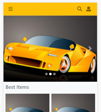
แบบที่ แสดงเฉพาะ Slide อย่างเดียว
1 2 3 4 5 6 7 8 9 | <div id="carousel_myslide" class="carousel slide" data-ride="carousel"> <div class="carousel-inner"> <?php for($i=1;$i<=3;$i++){?> <div class="carousel-item <?=($i==1)?"active":""?>"> </div> <?php } ?> </div></div> |
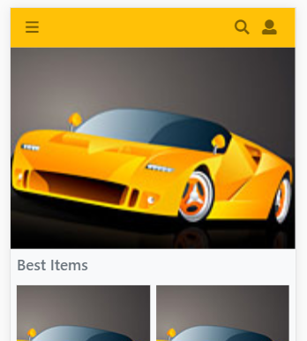
การแทรก slide แบบแรกนั้น จะเป็นวิธีการอย่างง่าย รูปผลลัพธ์จะเป็นดังรูป และ slide จะเลือ่นอัตโนมัติในทุก 5 วินาที
หรือค่า interval ที่ 5000 เราสามารถกำหนดให้ slide เลื่อนเร็วขึ้นหรือช้าลง ได้โดยกำหนด ค่า data-interval="1000"
เข้าไป หากต้องการให้เลื่อน slide ทุก 1 วินาที เช่น
1 | <div id="carousel_myslide" class="carousel slide" data-ride="carousel" data-interval="1000"> |
ในการใช้งานทุกครั้งเราควรกำหนด id ให้กับ slide เพื่อใช้การอ้างอิงกรณีมีการใช้งานเพิ่มเติม เช่นเมื่อมีการใช้งาน control
หรือปุ่มควบคุม ในตัวอย่างเรากำหนด id="carousel_myslide"
สำหรับในตัวอย่าง เราใช้การสมมติรายการโดยการวนลูป ด้วยใช้ for() ฟังก์ขั่น เวลาใช้จริง เราสามารถวนลูปจากฐานข้อมูล
หรือจาก array ข้อมูลก็ได้ และในตัวอย่าง เรามีการกำหนด "active" class ให้กับรายการ slide แรก เพื่อเริ่มต้นรายการที่จะแสดง
แรกเป็นรายการที่ 1 การวนลูปในรายการตัวอย่าง ใช้รูปเดียวกัน ผลลัพธ์อาจจะไม่ชัดเจนนัก แต่สังเกตได้จากการ slide หรือการ
เลื่อนของรายการได้
การปรับแต่ง Carousel ด้วย Javascript
เราสามารถกำหนด option การตั้งค่าเพิ่มเติมให้กับ slide ผ่านทาง javascript รวมถึงการตรวจจับ event ของการ slide
เพื่อให้ทำคำสั่งอื่นๆ เพิ่มเติมได้ เช่น
1 2 3 4 5 6 | // การกำหนดตั้งค่าให้กับ slide เพิ่มเติม$('#carousel_myslide').carousel({ interval: 3000, // กำหนดให้ slide รายการทุก 3 วินาที pause:"hover" // ให้หยุด slide ชั่วคราวเมื่อวางเมาส์อยู่เหนือรายการ มีผลเฉพาะ desktop // และเลื่อนอีกครั้งเมื่อลเลื่อนเมาส์ออก กรณืมือถือจะมีผลเมื่อ แตะที่ slide}); |
เราสามารถสร้างตัวควบคุม แบบกำหนดเอง แล้วใช้ส่วนจัดการ carousel ผ่าน javascript ควบคุม สมมติเราใช้
pagination component สร้างตัวควบคุม slide เป็นดังนี้
1 2 3 4 5 6 7 8 9 10 11 12 13 14 15 16 17 18 | <div id="carousel_myslide" class="carousel slide" data-ride="carousel"> <div class="carousel-inner"> <?php for($i=1;$i<=3;$i++){?> <div class="carousel-item <?=($i==1)?"active":""?>"> </div> <?php } ?> </div></div> <nav class="mt-2"> <ul class="myslide_control pagination justify-content-center"> <li class="page-item"><a class="page-link" href="#">Prev</a></li><?php for($i=1;$i<=3;$i++){?> <li class="page-item"><a class="page-link" href="#"><?=$i?></a></li><?php } ?> <li class="page-item"><a class="page-link" href="#">Next</a></li> </ul></nav> |
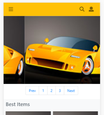
จากนั้น เราจะใช้ การส่งค่าตัวเลข สำหรับ slide ลำดับต่างๆ โดยค่าที่ส่งไปใช้งานจะเป็น base 0 หรือก็คือเริ่มต้นที่ 0
หมายความว่า slide ที่ 1 จะส่งค่าเป็น 0 ไป และเราจะส่งค่า "prev" สำหรับเลื่อน slide ไปลำดับก่อนหน้า หรือวนกลับ
จากด้านหลัง และเราส่งค่าเป็น "next" สำหรับเลื่อน slide ไปลำดับถัดไป หรือวนกลับไปด้านหน้า โดยจะได้ส่วนของปรับแต่ง
ใน javascript เป็นดังนี้
1 2 3 4 5 6 7 8 9 10 11 12 13 14 15 16 17 18 | // เมื่อคลิกลิ้งค์ของปุ่มควบคุม ที่กำหนดเอง$(".myslide_control a").on("click",function(e){ var pattern_number = /^[0-9]+$/; // รูปแบบการตรวจสอบตัวเลข var textNumber = $(this).text();// ใช้ค่าข้อความหรือตัวเลขจากปุ่ม textNumber = textNumber.toLowerCase(); // ปรับข้อความเป็นตัวพิมพ์เล็ก if(textNumber.match(pattern_number)){ // ตรวจสอบว่าเป็นตัวเลขหรือไม่ textNumber = parseInt(textNumber)-1; // ปรับเป็นชนิด number แล้วลบ 1 } $('#carousel_myslide').carousel(textNumber); // เรียกคำสั่ง carousel e.preventDefault(); // ปิดการใช้งานลิ้งค์ปกติ});// การกำหนดตั้งค่าให้กับ slide เพิ่มเติม$('#carousel_myslide').carousel({ interval: 3000, // กำหนดให้ slide รายการทุก 3 วินาที pause:"hover" // ให้หยุด slide ชั่วคราวเมื่อวางเมาส์อยู่เหนือรายการ มีผลเฉพาะ desktop // และเลื่อนอีกครั้งเมื่อลเลื่อนเมาส์ออก กรณืมือถือจะมีผลเมื่อ แตะที่ slide}); |
คำสั่ง ที่ใช้งานจากรูปแบบโค้ดข้างต้นคือ
1 2 3 | .carousel(number) // ไปยัง slide ลำดับที่ โดยเริ่มต้นที่ 0 .carousel('prev') // ไปยัง slide ก่อนหน้า.carousel('next') // ไปยัง slide ถัดไป |
ต่อไปเราลองประยุกต์เพิ่มเติม โดยใช้ fontawesome มากำหนดใน control เป็นดังนี้
1 2 3 4 5 6 7 8 9 10 11 12 13 14 15 16 17 18 19 20 21 22 | <div id="carousel_myslide" class="carousel slide" data-ride="carousel"> <div class="carousel-inner"> <?php for($i=1;$i<=3;$i++){?> <div class="carousel-item <?=($i==1)?"active":""?>"> </div> <?php } ?> </div></div> <nav class="mt-2"> <ul class="myslide_control pagination justify-content-center"> <li class="page-item"><a class="page-link" href="#"> <i class="fas fa-step-backward"></i> </a></li> <li class="page-item"><a class="page-link" href="#"> <i class="fas fa-pause"></i> </a></li> <li class="page-item"><a class="page-link" href="#"> <i class="fas fa-step-forward"></i> </a></li> </ul></nav> |
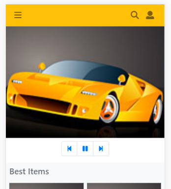
และในส่วนของ javascript ควบคุม เราจะเช็คจาก icon โดยเมื่อผู้ใช้กดที่ icon ใดๆ ก็ให้ทำหน้าที่ตามที่เรากำหนด
โดยเริ่มต้น icon "pause" จะแสดงก่อน เพราะ slide เริ่มทำงานเมื่อโหลดเสร็จ ถ้าเรากดปุ่ม pause ก็จะหยุดชั่วคราว
และปุ่ม pause ก็จะเปลี่ยนเป็นปุ่ม play คือถ้ากดก็จะเริ่มเล่นต่อ นอกจากนั้นเรายังมีปุ่ม step-backward และ step-forward
เพื่อไปลำดับก่อนหนัา หรือลำดับถัดไป ส่วนของ javascript ก็จะเป็นดังนี้
1 2 3 4 5 6 7 8 9 10 11 12 13 14 15 16 17 18 19 20 21 22 23 | // เมื่อคลิกลิ้งค์ของปุ่มควบคุม ที่กำหนดเอง$(".myslide_control a").on("click",function(e){ var objCheck = $(this).find("i"); // อ้างอิง icon if(objCheck.hasClass("fa-step-backward")){ // ถ้ากดปุ่ม ย้อนกลับหรือก่อนหน้า $('#carousel_myslide').carousel('prev'); }else if(objCheck.hasClass("fa-pause")){ // ถ้ากดปุ่มหยุดชั่วคราว objCheck.removeClass("fa-pause").addClass("fa-play"); $('#carousel_myslide').carousel('pause'); }else if(objCheck.hasClass("fa-play")){ // ถ้ากดปุ่มเล่นต่อ objCheck.removeClass("fa-play").addClass("fa-pause"); $('#carousel_myslide').carousel('cycle'); }else if(objCheck.hasClass("fa-step-forward")){ // ถ้ากดปุ่ม ถัดไป $('#carousel_myslide').carousel('next'); } e.preventDefault(); // ปิดการใช้งานลิ้งค์ปกติ});// การกำหนดตั้งค่าให้กับ slide เพิ่มเติม$('#carousel_myslide').carousel({ interval: 3000, // กำหนดให้ slide รายการทุก 3 วินาที pause:"hover" // ให้หยุด slide ชั่วคราวเมื่อวางเมาส์อยู่เหนือรายการ มีผลเฉพาะ desktop // และเลื่อนอีกครั้งเมื่อลเลื่อนเมาส์ออก กรณืมือถือจะมีผลเมื่อ แตะที่ slide}); |
คำสั่ง ที่ใช้งานจากรูปแบบโค้ดข้างต้นคือ
1 2 3 4 | .carousel('pause') // เพื่อหยุด slide ชั่วคราว.carousel('cycle') // เพื่อเล่น slide ต่อ.carousel('prev') // ไปยัง slide ก่อนหน้า.carousel('next') // ไปยัง slide ถัดไป |
การใช้งาน Events ของ Carousel
ในการใช้งาน carousel จะเกิด event หรือเหตุการณ์ขึ้น 2 กรณีคือเมื่อ เรื่มมีการเลื่อน slide รายการ และ
เมื่อทำการ slide รายการเสร็จ คำว่าเลื่อน slide รายการ หมายถึง เมื่อเลื่อน slide รายการแต่ละอัน ไม่ได้หมายถึง
เลื่อนถึงลำดับสุดท้าย
สำหรับการตรวจสอบ event ของ slide เราจะใช้รูปแบบดังนี้
1 2 3 4 5 6 7 8 | // เมื่อเริ่ม slide รายการ$('#carousel_myslide').on('slide.bs.carousel', function (e) { console.log("เมื่อรายการ slide หนึ่งๆ เริ่ม slide");});// เมื่อ slide รายการเสร็จแล้ว$('#carousel_myslide').on('slid.bs.carousel', function (e) { console.log("เมื่อรายการ slide หนึ่งๆ slide เสร็จ");}); |
โดยใน event ที่เกิดขึ้น จะมี property ค่าเพิ่มเติมให้เราเรียกใช้งานผ่านค่า event หรือ ตัวแปร e ที่เรากำหนดในฟังก์ช่น
ซึ่งจะประกอบไปด้วย
- direction: ทิศทางของ slide ปกติก็จะเป็นไปทางซ้าย หรือขวา "left" / "right"
- relatedTarget: เป็น DOM element slide ลำดับที่จะแสดง ปกติก็จะเป็น <div class="carousel-item">
- from: ตำแหน่ง index ของ slide ที่กำลังจะเปลี่ยน
- to: ตำแหน่ง index ของ slide ที่กำลังจะแสดง
ตัวอย่างการใช้ประโยชน์จาก property ค่าเพิ่มเติม ก็อย่างเช่น สมมติ ถ้า slide มาถึงรายการที่ 2 เราอาจจะ alert
แจ้งหรือทำคำสั่งใดๆ เพิ่มเติมได้ ตัวอย่างโค้ดก็จะได้เป็น
1 2 3 4 5 6 7 8 | // เมื่อเริ่ม slide รายการ$('#carousel_myslide').on('slide.bs.carousel', function (e) { console.log(e.to); if(e.to==1){ // base index 0 ดังนั้น ลำดับที่ 2 คือ 1 console.log("This is slide nubmer 2"); }// console.log("เมื่อรายการ slide หนึ่งๆ เริ่ม slide");}); |
การแสดง Carousel แบบมีปุ่มควบคุม และมีตัวกำกับตำแหน่ง
เราจะกลับมาที่รูปแบบเริ่มต้น และตัดส่วนของ ปุ่มควบคุมที่กำหนดเองออก แล้วจะใช้รูปแบบปุ่มควบคุม ของตัว
carousel รวมถึงตัวกำกับตำแหน่ง ที่เรียกว่า indicators จะได้รูปแบบดังนี้
แบบแสดง Control และ Indicators
1 2 3 4 5 6 7 8 9 10 11 12 13 14 15 16 17 18 19 20 21 22 | <div id="carousel_myslide" class="carousel slide" data-ride="carousel"> <ol class="carousel-indicators"> <?php for($i=1;$i<=3;$i++){?> <li data-target="#carousel_myslide" data-slide-to="<?=$i-1?>"></li> <?php } ?> </ol> <div class="carousel-inner"> <?php for($i=1;$i<=3;$i++){?> <div class="carousel-item <?=($i==1)?"active":""?>"> </div> <?php } ?> </div> <a class="carousel-control-prev" href="#carousel_myslide" role="button" data-slide="prev"> <span class="carousel-control-prev-icon" aria-hidden="true"></span> <span class="sr-only">Previous</span> </a> <a class="carousel-control-next" href="#carousel_myslide" role="button" data-slide="next"> <span class="carousel-control-next-icon" aria-hidden="true"></span> <span class="sr-only">Next</span> </a></div> |
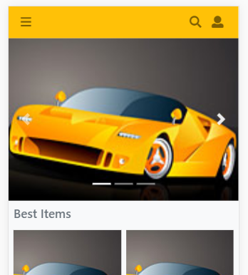
จะเห็นว่าส่วนที่เพิ่มเข้ามา คือ <ol class="carousel-indicators"> โดยจำนวนรายการจะเท่ากับจำนวนของรายการ slide
1 2 3 4 5 | <ol class="carousel-indicators"><?php for($i=1;$i<=3;$i++){?> <li data-target="#carousel_myslide" data-slide-to="<?=$i-1?>"></li> <?php } ?> </ol> |
ในตัวอย่างเราใช้การวนลูปด้วยคำสั่ง for เป็นตัวอย่าง สังเกตว่า data-target จะต้องกำหนดเป็น id ของ slide ที่เราจะใช้งาน
เรากำหนดเป็น data-target="#carousel_myslide" ส่วนการกำหนด data-slide-to ใช้สำหรับระบุว่า แต่ละ indicator นั้น
สัมพันธ์กับ slide ลำดับที่เท่าใด โดยใช้ base 0 คือเริ่มต้นที่ค่า 0 สำหรับ slide ลำดับที่ 1
นอกจากนั้น เรามีการใช้งานส่วนควบคุมของ slide ผ่านลิ้งค์ 2 รายการ
1 2 3 4 5 6 7 8 | <a class="carousel-control-prev" href="#carousel_myslide" role="button" data-slide="prev"> <span class="carousel-control-prev-icon" aria-hidden="true"></span> <span class="sr-only">Previous</span></a><a class="carousel-control-next" href="#carousel_myslide" role="button" data-slide="next"> <span class="carousel-control-next-icon" aria-hidden="true"></span> <span class="sr-only">Next</span></a> |
โดยจะใช้เป็นปุ่ม prev และ ปุ่ม next เพื่อเลื่อนรายการ
เราสามารถปรับแต่ง css ของ indicator ให้เป็นรุปแบบที่ต้องการได้ ในตัวอย่างจะเป็นแท่งสี่แหลี่ยมแนวนอน เราสามารถ
กำหนดเป็นสี่เหลี่ยมจัตุรัสขนาด 10px ได้ ดังนี้
1 2 3 4 5 6 | <style type="text/css">.carousel-indicators li{ width:10px; height:10px; }</style> |
หรือจะให้เป็นจุดวงกลมเล็กๆ ขนาด 10px ก็ได้ ดังนี้
1 2 3 4 5 6 7 8 9 | <style type="text/css">.carousel-indicators li{ width:10px; height:10px; -webkit-border-radius: 50%; -moz-border-radius: 50%; border-radius: 50%; }</style> |
การแสดง Card แบบเลื่อนได้ในแนวนอน
ต่อไปเป็นส่วนประยุกต์เพิ่มเติม ที่บทความที่แล้วเราได้รู้จักกับ card component เนื้อหาประยุกต์นี้ เราจะใช้ card แบบ
group แล้วใช้งาน utility ของ bootstrap รวมถึง css style เพิ่มเติมเพื่อปรับแต่ง โดยจะแสดงไว้ต่อจาก carousel ดังนี้
1 2 3 4 5 6 7 8 9 10 11 12 13 14 15 16 17 18 19 20 21 22 23 24 25 26 27 28 29 30 | <style type="text/css">/* ส่วนเนื้อหาที่เลื่อนได้ในแนวนอน*/.scroll-x{ display: flex; overflow-y: hidden; overflow-x: auto; -webkit-overflow-scrolling: touch;} /*ส่วนกำหนดให้ไม่แสดง scrollbar ของเนื้อหาแนวนอนี่กำหนด*/.scroll-x::-webkit-scrollbar { display: none; }</style><div class="container-fluid m-0 p-0 bg-light"> <!--container-fluid--> <h5 class="p-2 text-secondary">Category</h5> <div class="card-group d-flex flex-row flex-nowrap scroll-x"> <!--card group--> <?php for($i=1;$i<=6;$i++){?> <div class="card shadow-sm mb-2 mx-1" style="min-width:150px;"> <div class="card-body"> <h5 class="card-title">หัวข้อเพิ่มเติม</h5> <p class="card-text">รายละเอียดเพิ่มเพิ่ม รายละเอียดเพิ่มเพิ่ม รายละเอียดเพิ่มเพิ่ม </p> </div> </div> <?php } ?> </div> <!--card group--></div> |
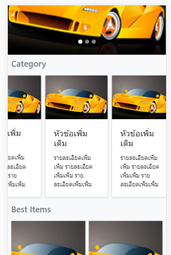
จากโค้ด เรากำหนด class "scroll-x" ซึ่งเป็นชื่อที่เรากำหนดเอง และจัดรูปแบบด้วย css style เราสามารถแก้ไข
ความกว้างของ แต่ละ card ด้วยการกำหนด style="min-width:150px;" ในตัวอย่างเรากำหนดเป็น 150px
สำหรับ card ในแนวนอนที่เราเพิ่มเข้ามานั้น เราสามารถใช้เมาส์หรือใช้นิ้วปัดไปทางซ้ายหรือทางขวา เพื่อแสดงรายการ
เพิ่มเติมที่ซ่อนอยู่ได้ ในตัวอย่างเราสมมติวนลูปแสดง 5 รายการ
โค้ดตัวอย่างแบบเต็ม เป็นดังนี้
ไฟล์ demo.php
1 2 3 4 5 6 7 8 9 10 11 12 13 14 15 16 17 18 19 20 21 22 23 24 25 26 27 28 29 30 31 32 33 34 35 36 37 38 39 40 41 42 43 44 45 46 47 48 49 50 51 52 53 54 55 56 57 58 59 60 61 62 63 64 65 66 67 68 69 70 71 72 73 74 75 76 77 78 79 80 81 82 83 84 85 86 87 88 89 90 91 92 93 94 95 96 97 98 99 100 101 102 103 104 105 106 107 108 109 110 111 112 113 114 115 116 117 118 119 120 121 122 123 124 125 126 127 128 129 130 131 132 133 134 135 136 137 138 139 140 141 142 143 144 145 146 147 148 149 150 151 152 153 154 155 156 157 158 159 160 161 162 163 164 165 166 167 168 169 170 171 172 173 174 175 176 177 178 179 180 181 182 183 184 185 186 187 188 189 190 191 192 193 194 195 196 197 198 199 200 201 202 203 204 205 206 207 208 209 210 211 212 213 214 215 216 217 218 219 220 221 222 223 224 225 226 227 228 229 230 231 232 233 234 235 236 237 238 239 240 241 242 243 244 245 246 247 248 249 250 251 252 253 254 255 256 257 258 259 260 261 262 263 264 265 266 267 268 269 270 271 272 273 274 275 276 277 278 279 280 281 282 283 284 285 286 287 288 289 290 291 292 293 294 295 296 297 298 299 300 301 302 303 304 305 306 307 308 309 310 311 312 313 314 315 316 317 318 319 320 | <!doctype html><html><head> <meta charset="utf-8"> <meta name="viewport" content="width=device-width, initial-scale=1, shrink-to-fit=no"> <title>Document</title> <style type="text/css"> body{ font-family: system-ui,-apple-system,BlinkMacSystemFont,Helvetica Neue,Helvetica,sans-serif; font-size: 14px; } .pic_preview{height:auto;padding-bottom:100%;background-size:cover;background-position:center;} .price{font-size: 18px;font-weight: 500;color: #f57224;} .discount_price{font-size: 10px;color: #9e9e9e;} .cus-icon:before { width: 30px; height: 30px; } /*sidemenu ด้านซ้าย*/ .l-sidenav { position: fixed; z-index: 1040; top: 0; left: 0; height: 100%; width: 0; overflow-x: hidden; } /*sidemenu ด้านขวา*/ .r-sidenav { position: fixed; z-index: 1040; top: 0; right: 0; height: 100%; width: 0; overflow-x: hidden; } /*คลุมดำพื้นที่เนื้อหา*/ .page-overlay-bg{ position: absolute; z-index: 1040; width: 0; height: 100%; background-color: rgba(0,0,0,0.4); } /*ส่วนของ padding กำหนดเอง */ .p-haft{padding:.125rem}/* กำหนด indicator เพื่มเติม*/ .carousel-indicators li{ width:10px; height:10px; -webkit-border-radius: 50%; -moz-border-radius: 50%; border-radius: 50%; }/* ส่วนเนื้อหาที่เลื่อนได้ในแนวนอน*/ .scroll-x{ display: flex; overflow-y: hidden; overflow-x: auto; -webkit-overflow-scrolling: touch; } /*ส่วนกำหนดให้ไม่แสดง scrollbar ของเนื้อหาแนวนอนี่กำหนด*/ .scroll-x::-webkit-scrollbar { display: none; } </style></head><body> <!-- sidemenu ด้านซ้าย--><nav class="l-sidenav bg-light"><div class="card bg-warning"> <div class="navbar navbar-light"> <a class="invisible"></a> <button type="button" class="close close-l-sidenav btn pl-2"> <span aria-hidden="true">×</span></button> </div> <div class="card-body pt-1 text-center"> <img src="https://www.ninenik.com/images/9.jpg" class="rounded-circle" style="width:75px;height:75px;"> <h6 class="card-title">หัวข้อ หรือ ชื่อผู้ใช้</h6> <p class="card-text"> ข้อความอธิบายเพิ่มเติม </p> </div></div><ul class="list-group"> <li class="list-group-item d-flex justify-content-between align-items-center"> รายการเมนู 1 <span class="badge badge-primary badge-pill">14</span> </li> <li class="list-group-item d-flex justify-content-between align-items-center"> รายการเมนู 2 <span class="badge badge-primary badge-pill">2</span> </li> <li class="list-group-item d-flex justify-content-between align-items-center"> รายการเมนู 3 <span class="badge badge-primary badge-pill">1</span> </li></ul><ul class="nav flex-column"> <li class="nav-item"> <a class="nav-link active" href="#">Active</a> </li> <li class="nav-item"> <a class="nav-link" href="#">Link</a> </li> <li class="nav-item"> <a class="nav-link" href="#">Link</a> </li> <li class="nav-item"> <a class="nav-link disabled" href="#">Disabled</a> </li></ul><ul class="list-group list-group-flush"> <li class="list-group-item">ตัวเลือก 1</li> <li class="list-group-item">ตัวเลือก 2</li> <li class="list-group-item">ตัวเลือก 3</li></ul></nav> <!-- sidemenu ด้านขวา--><nav class="r-sidenav bg-light"><div class="card bg-light"> <div class="navbar navbar-light"> <a class="invisible"></a> <button type="button" class="close close-r-sidenav btn pl-2"> <span aria-hidden="true">×</span> </button> </div> <div class="card-body pt-1 text-center"> <img src="https://www.ninenik.com/images/9.jpg" class="rounded-circle" style="width:75px;height:75px;"> <h6 class="card-title">หัวข้อ หรือ ชื่อผู้ใช้</h6> <p class="card-text"> ข้อความอธิบายเพิ่มเติม </p> </div></div><ul class="list-group"> <li class="list-group-item d-flex justify-content-between align-items-center"> รายการเมนู 1 <span class="badge badge-primary badge-pill">14</span> </li> <li class="list-group-item d-flex justify-content-between align-items-center"> รายการเมนู 2 <span class="badge badge-primary badge-pill">2</span> </li> <li class="list-group-item d-flex justify-content-between align-items-center"> รายการเมนู 3 <span class="badge badge-primary badge-pill">1</span> </li></ul><ul class="nav flex-column"> <li class="nav-item"> <a class="nav-link active" href="#">Active</a> </li> <li class="nav-item"> <a class="nav-link" href="#">Link</a> </li> <li class="nav-item"> <a class="nav-link" href="#">Link</a> </li> <li class="nav-item"> <a class="nav-link disabled" href="#">Disabled</a> </li></ul><ul class="list-group list-group-flush"> <li class="list-group-item">ตัวเลือก 1</li> <li class="list-group-item">ตัวเลือก 2</li> <li class="list-group-item">ตัวเลือก 3</li></ul></nav> <div class="page-main w-100"><!-- page-main--><div class="page-overlay-bg"></div><!-- ส่วนของการใช้งาน navbar--> <nav class="navbar navbar-light bg-warning"><!-- ปุมด้านซ้าย แสดงเมนู--> <button class="navbar-toggler border-0 px-0 open-l-sidenav" type="button"> <i class="fas fa-bars cus-icon fa-fw py-1"></i> </button> <!-- ส่วนแสดงชื่อโปรเจ็ค หรือหัวข้อที่ต้องการ--><!-- <a class="navbar-brand" href="#">Navbar</a>--><!-- ปุมด้านขวา แสดงเมนู --> <div class="btn-group"> <button type="button" class="navbar-toggler border-0 px-2" onClick="$('#subnavbar').toggle()"> <i class="fas fa-search cus-icon py-1"></i> </button> <button type="button" class="navbar-toggler border-0 px-2 open-r-sidenav"> <i class="fas fa-user cus-icon py-1"></i> </button> </div> </nav> <nav class="navbar navbar-light sticky-top collapse" id="subnavbar" style="background-color:#f9ffbc;"> <form class="w-100"> <div class="input-group"> <input type="text" class="form-control" placeholder="Search"> <div class="input-group-append"> <button class="btn btn-outline-warning" type="button"> <i class="fas fa-search cus-icon py-1"></i> </button> </div> </div> </form></nav> <div id="carousel_myslide" class="carousel slide" data-ride="carousel"> <ol class="carousel-indicators"> <?php for($i=1;$i<=3;$i++){?> <li data-target="#carousel_myslide" data-slide-to="<?=$i-1?>"></li> <?php } ?> </ol> <div class="carousel-inner"> <?php for($i=1;$i<=3;$i++){?> <div class="carousel-item <?=($i==1)?"active":""?>"> </div> <?php } ?> </div> <a class="carousel-control-prev" href="#carousel_myslide" role="button" data-slide="prev"> <span class="carousel-control-prev-icon" aria-hidden="true"></span> <span class="sr-only">Previous</span> </a> <a class="carousel-control-next" href="#carousel_myslide" role="button" data-slide="next"> <span class="carousel-control-next-icon" aria-hidden="true"></span> <span class="sr-only">Next</span> </a></div> <div class="container-fluid m-0 p-0 bg-light"> <!--container-fluid--> <h5 class="p-2 text-secondary">Category</h5> <div class="card-group d-flex flex-row flex-nowrap scroll-x"> <!--card group--> <?php for($i=1;$i<=6;$i++){?> <div class="card shadow-sm mb-2 mx-1" style="min-width:150px;"> <div class="card-body"> <h5 class="card-title">หัวข้อเพิ่มเติม</h5> <p class="card-text">รายละเอียดเพิ่มเพิ่ม รายละเอียดเพิ่มเพิ่ม รายละเอียดเพิ่มเพิ่ม </p> </div> </div> <?php } ?> </div> <!--card group--></div><div class="container-fluid m-0 p-0 bg-light"> <!--container-fluid--> <h5 class="p-2 text-secondary">Best Items</h5> <div class="row no-gutters px-1"> <!--row--> <?php for($i=1;$i<=4;$i++){?> <div class="col-6 col-sm-4 col-md-3 bg-light px-1"> <a href="javascript:void(0);"> <div class="bg-warning pic_preview" style="background-image:url('https://www.ninenik.com/images/10.jpg')"> </div> <div class="bg-white mb-2 shadow-sm"> <div>หัวเรื่องรายการทดสอบ This is test title</div> <div class="price">฿1,500</div> <div class="discount_price">฿2,500 <span>-50%</span></div> </div> </a> </div> <?php } ?> </div> <!--row--> </div> <!--container-fluid--></div><!-- page-main--> <script type="text/javascript">$(function(){ // การกำหนดตั้งค่าให้กับ slide เพิ่มเติม $('#carousel_myslide').carousel({ interval: 3000, // กำหนดให้ slide รายการทุก 3 วินาที pause:"hover" // ให้หยุด slide ชั่วคราวเมื่อวางเมาส์อยู่เหนือรายการ มีผลเฉพาะ desktop // และเลื่อนอีกครั้งเมื่อลเลื่อนเมาส์ออก กรณืมือถือจะมีผลเมื่อ แตะที่ slide }); // เมื่อเริ่ม slide รายการ $('#carousel_myslide').on('slide.bs.carousel', function (e) { // console.log("เมื่อรายการ slide หนึ่งๆ เริ่ม slide"); }); // เมื่อ slide รายการเสร็จแล้ว $('#carousel_myslide').on('slid.bs.carousel', function (e) { // console.log("เมื่อรายการ slide หนึ่งๆ slide เสร็จ"); }); /*เมื่อปุ่มปิด หรือ เปิด เมนูด้านซ้ายถูกคลิก*/ $(".close-l-sidenav,.open-l-sidenav").on("click",function(){ $("html").css("overflow-x","hidden"); /*ป้องกันการแสดง scroolbar ในแนวนอน*/ $(document.body).css({"position":"relative","overflow-x":"hidden"}); /*ป้องกันการแสดง scroolbar ในแนวนอน*/ var toggleWidth = ($(".l-sidenav").width()==0)?250:0; $(".l-sidenav").width(toggleWidth); var toggleMarginLeft = toggleWidth; /*ให้ขยับส่วนของคลุมดำออกไปเท่ากับความกว้างของเมนูที่ขยับเข้ามา*/ var toggleOverlayWidth = ($(".page-overlay-bg").width()==0)?"100%":0; /*ซ่อนหรือแสดงโดยการกำหนดค่าความกว้าง*/ var fullHeight = $(".page-main").height(); /* ความสูงของเนื้อหา*/ $(".page-main").css("margin-left",toggleMarginLeft); /*ขยับส่วนของเนื้อหาตามการแสดงของเมนูด้านซ้าย*/ $(".page-overlay-bg").height(fullHeight); /*ให้ความสูงของพื้นที่คลุมดำเท่ากับเนื้อหา*/ $(".page-overlay-bg").width(toggleOverlayWidth); /*ให้ความกว้างของพื้นที่คลุมดำเท่ากับ 100% หรือ 0*/ }); /*เมื่อปุ่มปิด หรือ เปิด เมนูด้านขวาถูกคลิก*/ $(".close-r-sidenav,.open-r-sidenav").on("click",function(){ /*กำหนดเงื่อนไข กรณีแสดงแบบเต็มจอ ถ้าความกว้างเริ่มต้นเป็น 0 ให้แสดง 100% */ var toggleWidth = ($(".r-sidenav").width()==0)?"100%":0; $(".r-sidenav").width(toggleWidth); }); });</script></body></html> |
ทั้งหมดเป็นแนวทางการใช้งาน carousel และการประยุกต์ card แสดงแบบเลื่อนได้ในแนวนอน หวังว่าเนื้อหาข้างต้น
จะเป็นแนวทางไปปรับใช้เพิ่มเติม ได้ต่อไป

 อ่านต่อที่บทความ
 เนื้อหาที่เกี่ยวข้อง